FREE ASSISTANCE FOR THE INQUISITIVE PEOPLE


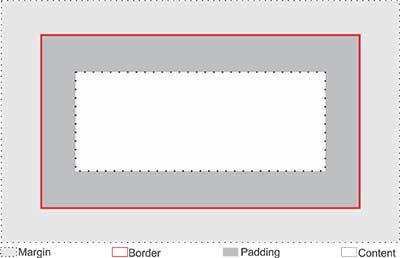
To design a layout in HTML with CSS, we use the Box Model of CSS. We consider every element of HTML is a box. In modern webpage design every element should wrap within another box. Every box has the following parts
Example
CSS CODE
div
{
width: 200px;
border: 5px solid red;
padding: 50px;
margin: 10px;
}

HTML CODE
<!DOCTYPE html>
<html>
<head>
<title>Box Model Demo</title>
<link href="style.css" rel="stylesheet" type="text/css" />
</head>
<body>
<div>On the Insert tab, the galleries include items that are designed to coordinate with the overall look of your document.</div>
<div>On the Insert tab, the galleries include items that are designed to coordinate with the overall look of your document.</div>
</body>
</html>

We can set the width and height properties of an HTML element using the Width and Height properties of CSS.
Example 1
CSS CODE
div
{
width: 220px;
border: 5px solid red;
padding: 25px;
margin:10px;
}
HTML CODE
<!DOCTYPE html>
<html>
<head>
<title>Box Model width and Height Demo</title>
<link href="style.css" rel="stylesheet" type="text/css" />
</head>
<body>
<div>On the Insert tab, the galleries include items that are designed to coordinate with the overall look of your document.</div>
<img src="12-flower-wallpaper.previewh.jpg" width="300" height="188">
</body>
</html>


= width + 2 * border + 2 * padding + 2 * margin
= 220 + 2 * 5 + 2 * 25 + 2 * 10
= 220 + 10 + 50 + 20
= 300px
Here the total width of the image and div is same. But due to the margin section this is not reflected properly.
Important: In this case you always ajust the width and height of the content area and calculate the full size of an element.
Example 2
In Example 2 we change only the CSS code.
CSS CODE
div
{
width: 240px;
border: 5px solid red;
padding: 25px;
margin-bottom:10px;
}