FREE ASSISTANCE FOR THE INQUISITIVE PEOPLE


We can display alert by predefined classes in bootstrap. Bootstrap Alert is a very useful component to display different messages to user. Four types of alert are possible in bootstrap.

Alerts are designed with .alert class. After using the .alert class we must use one of the following class
<div class="alert alert-success">
<strong> Success! </strong> display some successful information to the user.
</div>
<div class="alert alert-info">
<strong> Info! </strong> display some information to the user.
</div><div class="alert alert-warning">
<strong> Warning! </strong> display some warning to the user.
</div><div class="alert alert-danger">
<strong> Danger! </strong>display some message to the user that indicates a malfunction.
</div>

By default the alert class is not dismissible. But we can make it dismissible by using a link or button with .close class and data-dismiss=”alert”
<!DOCTYPE html>
<html lang="en">
<head>
<title>Bootstrap Alert Example</title>
<link rel="stylesheet" href="https://maxcdn.bootstrapcdn.com/bootstrap/3.3.7/css/bootstrap.min.css" >
<script src="https://ajax.googleapis.com/ajax/libs/jquery/1.12.4/jquery.min.js"> </script>
<script src="https://maxcdn.bootstrapcdn.com/bootstrap/3.3.7/js/bootstrap.min.js"> </script>
</head>
<body><div class="container">
<div class="alert alert-success" role="alert">
<a href="#" class="close" data-dismiss="alert" aria-label="close">×</a>
You Are <strong>Successfully</strong> Loged In
</div>
</div>
</body>
</html>

Animation when dismiss the alert are possible. For that we have to use the .fade class and .in class in the alert div.
<!DOCTYPE html>
<html lang="en">
<head>
<title>Bootstrap Alert Example</title>
<meta charset="utf-8">
<meta name="viewport" content="width=device-width, initial-scale=1">
<!-- <link rel="stylesheet" href="bootstrap/css/bootstrap.min.css"> -->
<link rel="stylesheet" href="https://maxcdn.bootstrapcdn.com/bootstrap/3.3.7/css/bootstrap.min.css">
<script src="https://ajax.googleapis.com/ajax/libs/jquery/1.12.4/jquery.min.js"></script>
<script src="https://maxcdn.bootstrapcdn.com/bootstrap/3.3.7/js/bootstrap.min.js"></script>
</head>
<body>
<div class="container">
<div class="alert alert-danger fade in">
<a href="#" class="close" data-dismiss="alert" aria-label="close">×</a>
<strong> Danger! </strong> display some message to the user that indicate a malfunction.
</div>
</div>
</body>
</html>
link to the another image, page or anything is also possible in Bootstrap Alerts by .alert-link class.
<!DOCTYPE html>
<html lang="en">
<head>
<title>Bootstrap Alert Example</title>
<meta charset="utf-8">
<meta name="viewport" content="width=device-width, initial-scale=1">
<link rel="stylesheet" href="https://maxcdn.bootstrapcdn.com/bootstrap/3.3.7/css/bootstrap.min.css">
<script src="https://ajax.googleapis.com/ajax/libs/jquery/1.12.4/jquery.min.js"></script>
<script src="https://maxcdn.bootstrapcdn.com/bootstrap/3.3.7/js/bootstrap.min.js"></script>
</head>
<body><div class="container">
<div class="alert alert-success" role="alert"><strong>Well Come!</strong> Learn Bootstrap from <a href="#" class="alert-link">Tutorial At Home </a>
</div>
<div class="alert alert-info" role="alert">
<strong>Well Come!</strong> Learn Bootstrap from <a href="#" class="alert-link">Tutorial At Home </a>
</div>
<div class="alert alert-warning" role="alert">
<strong>Well Come!</strong> Learn Bootstrap from <a href="#" class="alert-link">Tutorial At Home </a>
</div>
<div class="alert alert-danger" role="alert">
<strong>Well Come!</strong> Learn Bootstrap from <a href="#" class="alert-link">Tutorial At Home </a>
</div>
</div>
</body>
</html>

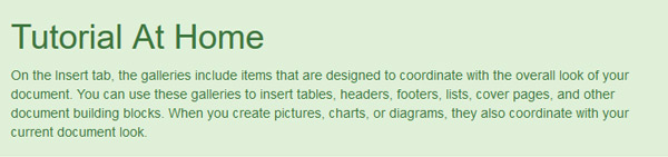
We can also set a heading using .alert-heading class.

<div class="alert alert-success" role="alert">
<h4 class="alert-heading">Tutorial At Home</h4>
<p> On the Insert tab, the galleries include items that are designed to coordinate with the overall look of your document. You can use these galleries to insert tables, headers, footers, lists, cover pages, and other document building blocks. When you create pictures, charts, or diagrams, they also coordinate with your current document look.
</p>
</div>